I have just read the Presentation Zen blog post about PowerPoint.
One of the interesting suggestions was that it’s not effective to present the same information twice, so you don’t have notes covering what you say. Having a diagram that gives the same information is effective though because it gives a different way of analyzing the data. I looked at a couple of sets of slides that I have written and noticed that the ratio of text slides to diagram slides was 6:1 and 3:1 in favor of text, and that wasn’t counting the first and last slides that have the title of the talk and a set of URLs respectively.
So it seems that I need more and better diagrams. I’ll include most of the diagrams I use in my current SE Linux talks in this post with some ideas on how to improve them. I would appreciate any suggestions that may be offered (either through blog comments or email).
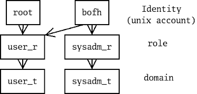 The above diagram shows how the SE Linux identity limits the roles that may be selected, and how the role limits the domains that may be entered. Therefore the identity controls what the user may do and in this example the identity “root” means that the user has little access to the machine (a Play Machine configuration). I think that the above is reasonably effective and have been using it for a few years. I have considered a more complex diagram with the “staff_r” role included as well and possibly including the way that “newrole” can be used to change between roles. So I could have the above as slide #1 about identities and roles with a more detailed diagram following to replace a page of text about role transition.
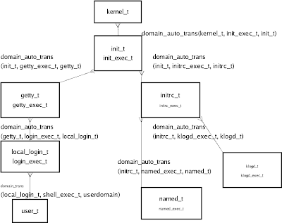 The above diagram shows the domain transitions used in a typical system boot and login process. It includes the names of the types and a summary of the relevant policy rules used to implement the transitions. I also have another diagram that I have used which is the same but without the file types and policy. In the past I have never used both in the one talk – just used one of the two and had text to describe the information content of the other. To make greater use of diagrams I could start with the simple diagram and then have the following slide have all the detail.
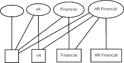 The above diagram simply displays the MCS security model with ellipses representing processes and rectangles representing files.
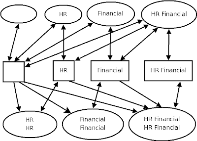 The above diagram shows a simplified version of the MMCS policy. With MMCS each process has a range with the low level representing the minimum category set of files to which it is permitted to write and the high level representing the files that it may read and write. So to write to a file with the “HR” category the process must have a low level that’s no higher than “HR” and a high level that is equal or greater than “HR“. The full set of combinations of two categories with low and high levels means 10 different levels of access for processes which makes for a complex diagram. I need something other than plain text for this but the above diagram is overly complex and a full set is even more so. Maybe a table with process contexts on one axis, file contexts on another and access granted being one of “R“, “RW” or nothing?
I also have a MLS diagram in the same manner, but I now think it’s too awful to put on my blog. Any suggestions on how to effectively design a diagram for MLS? For those of you who don’t know how MLS works the basic concept is that every process has an “Effective Clearance” (AKA low level) which determines what it can write, it can’t write to anything below that because it might have read data from a file at it’s own level and it can’t read from a level higher than it’s own level. MLS also uses a high level for ranged processes and filesystem objects (but that’s when it gets really complex).
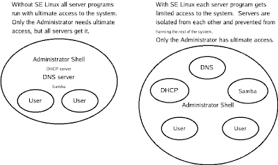 This last one is what I consider my most effective diagram. It shows the benefits of SE Linux in confining daemons in a clear and effective manner. Any suggestions for improvement (apart from fixing the varying text size which is due to a bug in Dia) would be appreciated.
The above diagrams are all on my SE Linux talks page, along with the Dia files that were used to create them. They may be used freely for non-commercial purposes.
If anyone has some SE Linux diagrams that they would like to share then please let me know, either through a blog comment, email, or a blog post syndicated on Planet SE Linux.
